Authoring guide
A .pres file is a plain-text source describing a whole presentation. It
has two parts: settings (global parameters) and content (the
slides). Revealer accepts raw HTML anywhere, just like reveal.js, but adds
a set of shortcuts so you can focus on the content.
Three things to remember:
Raw HTML is allowed anywhere — any line the parser does not recognise is passed through verbatim. A shortcut is never required; it is a shorthand for a common pattern.
A shortcut line must start with its marker (
*,!,>,===, …). A space after the marker is required where shown, and nested lists use 2 spaces per level.Slides live on a fixed canvas that reveal.js scales to fit the window (set its size with
> width:/> height:, e.g. 1920 × 1080). Author at natural sizes and let Revealer fit the content: each block shrinks its own font until it fits, so you rarely need to fight overflow by hand.
File structure
# --- SETTINGS --------------------------------------------------------------

> author: First author
> author: Second author
> event: Seminar place, 01/01/2026

> logo: Media/Images/Logos/Logo1.png
> logo: Media/Images/Logos/Logo2.png

> slideNumber: c/t

# --- CONTENT ---------------------------------------------------------------

>>> first: Title
> subtitle: Subtitle

=== Title of slide 1

This slide is <i>very</i> informative.

=== Title of slide 2

This slide is <b>extremely</b> informative.
Lines starting with # are comments and are skipped everywhere.
Settings
Settings are > key: value lines placed before the first slide. The
most common ones:
> title: Browser-tab title
> author: Your name             # repeatable; see Author photos below
> affiliation: Your institute   # repeatable
> event: Place, date
> logo: Media/logo.png          # repeatable
> theme: revealer               # see Themes
> slideNumber: c/t
> bibtex: refs.bib              # see Bibliography
> build: python figs.py         # see Figures pipeline
Any other > option: value is passed straight to Reveal.initialize()
(for example > controls: false, > transition: fade, > width: 1920).
The complete annotated list — look and identity, layout geometry, math,
figure hooks, PDF export — is in
Settings & directives.
Parameter scopes
Every > key: value directive applies to a scope, which determines how
far its effect reaches:
Scope |
Where it is written |
Applies to |
|---|---|---|
Presentation |
in the settings block, before the first slide |
the whole presentation |
Slide |
inside a slide, outside any column block |
the current slide |
Block |
at the top of a column block ( |
that column only |
Paragraph |
directly attached to a paragraph (no blank line before its content) |
that paragraph only |
Most directives have a fixed scope. Three of them — size, align and
paragraph-spacing — are contextual: their scope is deduced from
where they appear (see Sizes and alignment).
Slides and sections
Command |
Description |
|---|---|
|
First slide. Its content is generated automatically (title, subtitle, authors, affiliations, logos, event). |
|
Horizontal slide. The title renders in the fixed header bar. |
|
Vertical slide under the previous |
|
Section slide. Marks the start of a section; the header is removed. Add |
|
Bibliography slide(s). Adds formatted bibliography slides from the references cited with |
|
Include another file at build time. See Including other files. |
Per-slide directives
Written right after a slide marker:
Command |
Description |
|---|---|
|
Hide slide. |
|
Dark style for the current slide. |
|
Theme for the current slide. Temporarily switches the reveal.js theme while this slide is active. See Themes. |
|
Subtitle (first slide only). |
|
Remove the fixed header (full-bleed slides). |
|
Background image or colour. |
|
Video background (looped, muted). |
|
Background opacity for a background video. |
|
Text colour for the current slide. |
|
Raw attributes on the |
Citations, speaker notes, inline SVGs and SVG animation steps are covered
below; layout geometry (header-margin, column-spacing,
column-width, paragraph-spacing) in
Layout parameters.
Text
Paragraphs
Inside a slide — and inside each column — content is split into
paragraphs separated by blank lines. A paragraph can be a block of
text, a bullet list, an image, a video, a blockquote, a table, and so on.
Paragraphs are stacked vertically, centered in their block, with a uniform
spacing between them controlled by paragraph-spacing (in line-heights,
0.5 by default).
=== A slide

This is the first paragraph.

This is the second paragraph.
It can span several source lines.

<img src="media/figure.svg">

* a bullet list is a paragraph too
* second item
Leading and trailing blank lines are ignored, and several consecutive blank lines still count as a single break.
Inline formatting
Light markdown works in any text, list item, caption, cell or box title:
**bold**  *italic*  `code`  [a link](https://revealjs.com)
[accented]{.accent}  [red]{color=#c0392b}  [large]{size=1.4em}
[big]{.lede}  [small]{.sm}
[text]{...}spans accept.classtokens (added as CSS classes — themes provide roles such as.accent,.lede,.sm),color=andsize=.Math spans (
$…$,$$…$$) and HTML tags are left untouched.Escape a marker with a backslash:
\*,\`,\[.The whole layer can be disabled per deck with
> markdown: false.
Math
$inline$ and $$display$$ math render with KaTeX. A bare $$ … $$ line
produces a centered display equation; for a framed, theme-accented equation
box see Callout boxes and framed equations.
Your LaTeX macros can be reused with > macros: / > macro:.
Sizes and alignment
> size: sets a relative font size and > align: sets the alignment
(left, center, right, justify). size accepts a factor (0.8,
120%) or a role name — title (1.6), lede (1.25), body (1),
sm (0.8), fine (0.65). Their scope depends on where they appear:
Attached to a paragraph (immediately before its content, with no blank line in between): they affect only that paragraph.
Alone (followed by a blank line) at the top of a slide or a column: they become the default for that slide or that block.
Inside a
> … > end:block (callout box, card, fragment, table cell): they apply from that line to the end of the block —> size: reset/> align: nonereturns to the block’s default.In the settings block: they become the presentation default.
size factors cascade multiplicatively (presentation × slide × block ×
paragraph).
=== Sizes

> size: 0.8
> align: right
This paragraph is 80% of the base size and right-aligned.

> size: 0.5
* This list is half size…
* …and so is this item.
Images in a paragraph fill the block width by default and scale together
with the block font; you can still resize any of them with an explicit
width, e.g. <img src="..." style="width: 60%">.
Inside a table, put > align: at the start of the cell content:
> table(1,2)
> cell
> align: right
Right-aligned cell

> cell
> align: center
Centered cell
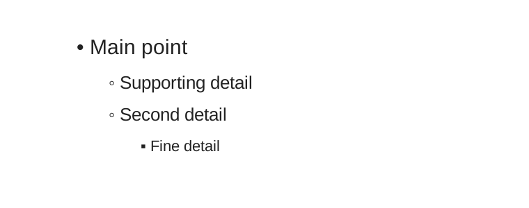
Bullet lists
Bullet lines start with * and can be nested with two spaces per level.
Revealer opens and closes the corresponding <ul> and <li> tags.
* Main point
  * Supporting detail
  * Second detail
    * Fine detail
Prefix a bullet’s text with + (optionally +N) to reveal that single item as
a fragment — it appears on click, in document order or at step N, just like the
+ flag on cards, layers and callouts:
* Shown immediately
* + Revealed on the next click
* +2 Revealed at step 2
Write * \+ text for a literal leading “+”.
Highlighted block
Use [ ... ] on a single line to produce a highlighted block.
[ This is an important point. ]

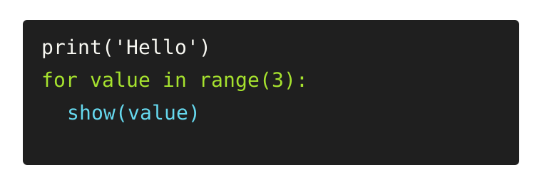
Code snippets
Use @@ fences for code blocks. Optional language names or reveal.js
attributes can follow the opening fence.
@@ python data-line-numbers
print('Hello')
for value in range(3):
  show(value)
@@
Columns
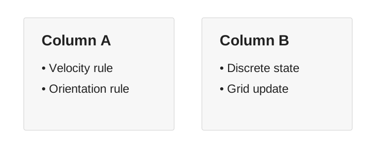
Use || to start and close a multi-column block. A line starting with |
starts the next column. Widths are optional; without them, columns share
the available width equally.
||
<h3>Column A</h3>
* Velocity rule
* Orientation rule
|
<h3>Column B</h3>
* Discrete state
* Grid update
||
Each block fills the full height of the central area and shrinks its own
font until its content fits (per-block scaling). Blocks are spread across
the full slide width, with an equal spacing at the edges and between them
(column-spacing, a slide parameter). Set > column-width: auto on the
slide to let Revealer rebalance the block widths so their font sizes come
out as even as possible.
Inside a column, bullet lists always start on their own line (they are rendered as block elements), so a list written right after a line of text does not flow next to it.
You can still provide explicit widths. They are used as CSS flex-basis
values:
|| 30%
Narrow column
| 65%
Wide column
||
Inside a multi-column block, each column can choose its own size and alignment:
=== Comparison

||
> align: left
Left column
|
> align: justify
Longer text in the right column can be justified.
||
Layout parameters
A slide is organised as a central area (the space left free by the optional header and footer) filled with one or more blocks (columns). Each block holds a stack of paragraphs and shrinks its own font until it fits. The geometry is controllable:
Command |
Scope |
Default |
Description |
|---|---|---|---|
|
presentation |
current look |
Header band height, as a fraction of the slide height. |
|
presentation |
current look |
Footer band height, as a fraction of the slide height. |
|
slide |
|
Vertical breathing margin between the header/footer and the central area, as a fraction of the slide height. |
|
slide |
|
Horizontal spacing used at the edges and between blocks, as a fraction of the slide width. |
|
slide |
|
Block widths. |
|
slide → block |
|
Spacing between paragraphs, in line-heights. Defined inside a column block, it applies to that block only. |
|
contextual |
|
Relative font size multiplier (e.g. |
|
contextual |
inherited |
Text alignment. |
Layout DSL: filling the canvas
By default a slide lays its content out as paragraphs. For
figure-heavy slides that need exact geometry, > fill switches the slide
body to a full-height flex column, and > row / > col build a layout
grid whose heights resolve against the canvas:
=== A figure-heavy slide
> fill
> row
> col 2/5 center
! Media/setup.png fill contain
> col 3/5
!! Media/experiment.mp4 | The experiment
> end: row
> fill [between|center|around|end]— the optional keyword sets the vertical distribution of the slide body.> row [+[N]] [gap] [h=NNN]opens a row of columns;h=pins the row height (useful to keep content aligned across consecutive slides).> col [size] [center] [relative] [clip] [+[N]]starts the next column. Sizes accept fractions (2/5), percentages, lengths (300px) or bare flex weights; without sizes, columns share the width equally.centercenters the column content vertically;relative+cliplet the column host an absolutely-positioned overlay.Rows nest: a
> rowinside a column splits it further.> end: rowcloses the row.> spaceadds vertical whitespace in the flow. Bare> spaceis a filling spacer (flex: 1) — it absorbs the free vertical space, so it pushes blocks apart, centres one, or pins one to the bottom.> space: 40px(also2em,10%) is a fixed gap of that height. Handy between two consecutive> grid(…)blocks, which otherwise sit flush against each other. (Filling needs a> fillslide; a fixed> space:works anywhere.)
Inside a > table(...) block, > row keeps its table meaning (a new table
row); everywhere else it opens a layout row.
The generic > end: name command closes any named environment (table,
grid, row, stack, pin, info, warn, good, eq, frag).
Grids and cards
> grid(rows, columns) builds a grid of cards — like a table, but with
card styling and optional per-card fragment reveal:
> grid(2,2) compact
> gap: 18px

> card
A bordered card

> card plain
! Media/logo.png h=80px

> card accent +
This card has an extra CSS class and reveals as a fragment

> card +: #EFF4FF
A fragment card with a background colour

> end: grid
Without compact the grid fills the slide; with it, the grid sizes to its
content and can sit next to other blocks. plain renders a chrome-less
cell. Any other token on > card is added as a CSS class, so themes can
offer card variants.
Stacks and pins
> stack overlays several media layers in one cell, cross-fading as
fragments — convenient to build up a figure step by step:
> stack h=400px
> layer
! Media/base.png fill
> layer +
! Media/with-annotations.png fill
> layer + clear
! Media/grid-overlay.svg fill contain
> end: stack
A fragment layer is opaque by default, hiding the layer beneath; clear
keeps it transparent (a see-through overlay). h= pins the stack height,
otherwise it fills its flex parent.
> pin: x% y% [w%] [+] places an absolute overlay with its center at the
given percentages of the slide body — annotations, arrows, badges:
> pin: 75% 20% 15% +
An annotation revealed as a fragment
> end: pin
Images and videos
! path inserts an image and !! path a video, each on a single line,
with optional flags, a fixed size and a caption. Media paths are relative
to the presentation folder.
! Media/figure.png | A captioned figure
! Media/logo.png h=80px
!! Media/movie.mp4 loop | A movie that loops
Flag |
Effect |
|---|---|
|
Fill a sized parent (a grid card or a layout region), cropping as needed. |
|
|
|
Anchor the media to the top of its box ( |
|
Fixed height / width ( |
|
Reveal the media as a fragment (optionally with an explicit index). |
|
Video playback options. Videos are always muted, play inline, autoplay when their slide or fragment is shown and reset when it is hidden. |
A trailing | caption adds a caption, styled as a figure caption (or as a
card label when the media sits inside a card).
! fig.pdf works too: PDF figures are converted to SVG on the fly and
cached, so TikZ output and matplotlib PDFs drop straight in. Together with
> build: hooks and the theme-matched matplotlib styles this forms the
figures pipeline — slides that regenerate their own figures
and never drift out of sync with the analysis.
Fragments
Most block shortcuts accept a trailing + (reveal as a fragment) or +N
(fragment with an explicit data-fragment-index, for simultaneous or
out-of-order reveals): ! image.png +2, > col 2/5 +, > row +,
> info + Title, > eq +3, > card +, > layer +, > pin: 50% 50% +.
To wrap arbitrary content in a fragment, use > frag [N]:
> frag 1
This whole block appears as one fragment, math included: $x^2$.
> end: frag
The browser editor’s fragment drawer (F) lists and reorders
a slide’s whole reveal sequence.
Callout boxes and framed equations
> info, > warn and > good produce coloured callout boxes with an
optional bold title; > eq frames an equation with the theme accent:
> info Dataset
African elephant, Kruger National Park
> end: info

> eq +
E = mc^2
> end: eq
The > eq body is wrapped in $$ ... $$ automatically when it contains no
$. A bare $$ ... $$ line produces a plain centered equation without the
frame. Callout and equation boxes accept the + / +N fragment flag; a
title after the flag becomes the box title.
Tables
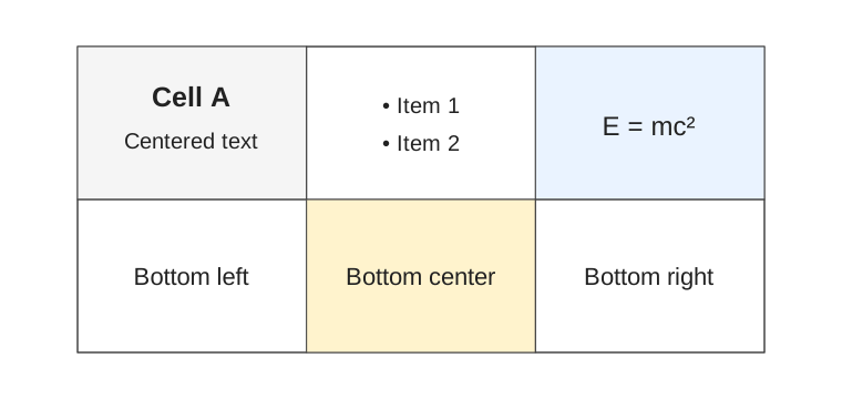
Use > table(rows, columns) to start a table environment. Cells are
centered both vertically and horizontally, and the table fills the
available slide area. > margin: and > border: configure the current
table and must appear inside the table block. > cell: starts a new cell,
with an optional background colour. > row: starts a new row and its first
cell. > end: table closes the table explicitly, but the table is also
closed automatically at the end of the slide.
> table(2,3)
> margin: 2rem
> border: true

> cell: #f5f5f5
<h3>Cell A</h3>
Centered text

> cell
* Item 1
* Item 2

> cell: #eaf3ff
$E = mc^2$

> row
Bottom left

> cell: #fff3cd
Bottom center

> cell
Bottom right

> end: table
> border: false keeps the grid invisible. Cell background colours default
to transparent.
Citations
Use > cite: inside a slide to register BibTeX entries. In the visible
text, place markers with <ref:...>. A short citation is rendered in the
slide footer and the full entry is added to the bibliography slides.
=== Related work
> cite: smith2026

A key result was reported<ref:smith2026>.
See Bibliography for BibTeX setup and bibliography slides.
Speaker notes
Use > notes: to mark the rest of the slide source as speaker notes. The
optional value sets the notes font size for that slide (presentation
default: > notesSize:).
=== Main result

The visible slide content goes here.

> notes: 1.1em
Remember to explain the intuition before showing the equation.
Raw slide attributes
Use > attr: to append raw attributes to the generated <section>
element. This is useful for reveal.js features that are not exposed
through a dedicated Revealer shortcut.
=== Auto-animated step
> attr: data-auto-animate

<div data-id="box">Same element, next state.</div>
Inline SVG and animation
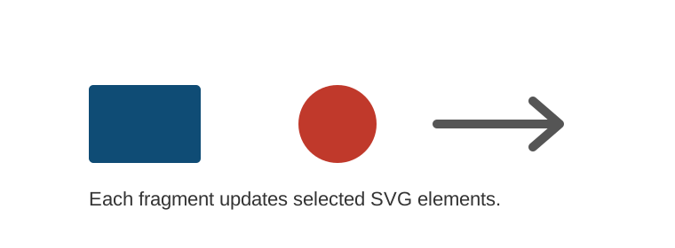
Use > svg: to embed an SVG file inline at the position of the directive
(the path is relative to the presentation folder), then reveal or
transform its elements step by step with repeatable > animate: lines,
optionally hiding some elements up front with > hide::
=== Animated SVG
> svg: Media/Animated/demo.svg
> hide: #dot, #arrow
> animate: #box fill:#0F4C75
> animate: #dot opacity:1; fill:#c0392b @ 1s
> animate: #arrow opacity:1 @ 300ms

Reveal SVG elements step by step.
See SVG animation for the full selector and duration syntax.
Including other files
> include: file.pres replaces the line by the file’s contents at build
time (recursive; paths resolve relative to the including file and must stay
inside the deck folder). It is made for lecture courses: keep each lecture
in its own .pres and assemble a master deck — see
Recipes › Assembling a lecture course.
Included slides rebuild on save like the main file, but are read-only in the browser editor — edit their own file instead.
KaTeX macros
Reuse your LaTeX macros in the settings block, either from a .tex file of
\newcommand definitions (relative to the deck folder) or inline —
> macro: can be repeated:
> macros: defs.tex
> macro: \half \frac{1}{2}
> macro: \R \mathbb{R}
Argument counts ([2]) can be declared but are dropped: KaTeX infers arity
from #n in the body. Custom > katex: { ... } options merge with the
bundled-KaTeX config and the macros instead of replacing them.
Build diagnostics
The build never fails on a syntax mistake — but it no longer stays silent
either. Anything the parser has to drop or reinterpret prints a
Warning: line N: … in the terminal (both revealer build and the live
revealer serve log):
an unrecognized
>directive (e.g. a typo like> grid(a,b)), with a hint when it looks like a construct child outside its parent (> cardwithout a> grid);a stray
> end: namethat closes nothing;a callout or equation block that is never closed and swallowed the next construct into itself (auto-closing at a slide or column boundary is fine and stays silent);
a bare
> spaceoutside a> fillslide (it only fills there — use> space: <size>elsewhere);a media path (
!/!!) that does not exist on disk.